A while back - on the Kiwi sporting martyrdom post, somewhere wayyyy down in the comments - it was proposed that a proper, scientific assessment be carried out on the topic of the most God-awful sporting uniforms ever to be extruded into the harsh and unsympathetic light of day, just 'cos this shit needs sorting, once and for all. Let it never be said we shirk the Big Questions here at the World of Bollocks.
This is, of course, an organic document. Feel free to identify and report examples of flagrant retina abuse perpetuated by sporting teams of your acquaintance. But for now, this is...
The World of Bollocks' Carton Of Piss:
The 24 Worst Uniforms In The History Of Sporting Endeavour
or 'What the fuck is that shit your boys are wearing?'
24. Houston Astros, mid-70s to mid-80s, baseball
Baseball offers a historic volume of win on this topic - case in point the stellar fashion accident that was the 1976 Chicago White Sox playing in collared shirts and shorts, looking like a fourth-grade school excursion gone wrong, and reportedly playing likewise - but check those Astros unis. You want Seventies cheese? I give you a veritable fondue set.
 |
| Wesley and Woody in a promo shot for the poorly received sequel,'White Men Can't Hit' |
23. Stade Francaise, last couple of seasons, French top-14 rugby


These guys lose points for being awful on purpose. See also, the London Harlequins.
22. Penrith Panthers, most of their existence, NSWRL/ARL/Super League/NRL


All superbly awful, but in particular, the mighty Chocolate Soldiers look of the '80s (top left). Get smeared in the mud for 80s minutes, have noone be the wiser, and still be able to pick up bogan slappers at the aftermatch at Panthers Leagues. Bewdy.
21. Sevilla FC, 2006/07, Spanish football
After their giant-killing runs in la Liga and twice winning the UEFA Cup in 2005-06 and 2006-07, the wheels fell off the Sevilla bus in 2007-08. Was it interest from other clubs destablising their new stars? Was it manager Juande Ramos departing for Spurs? Was it the pressure of raised expectations from their fanbase?
No. It was this.
 |
| Put your hands up if you think pink is a shit colour for a football shirt |
20. All AFL away jumpers, ever, Aussie Rules football
Are 'clash' guernseys so called because they clash with just about everything in the known fucking universe?


And that's without getting into some of the eye-searing hideousness seen over the years in the preseason comp. Jesus Christ.
19. Washington Wizards, 2007-09, NBA
 |
| All that glitters is not gold. Some of it is the stuff they make into cheap nasty satin bedwear worn by crack whores, the Wizards, and your mum. |
18. Gold Coast Chargers, 1997, ARL rugby league
 |
| Teal, purple and grey. The jersey so awful it drove rugby league out of the Gold Coast for ten years. |
17. Anything worn by Serena Williams, ever, tennis


'Nuff said.
16. FIAT Yamaha 'Cinquecento' promotional colourscheme,
2007 Dutch TT, MotoGP
 Even
the great Valentino Rossi couldn't avoid looking like a complete twat
on this dog's breakfast. He did manage to win the race, probably because
he wanted to get off the thing as quickly as possible and change into
something (a) less fucking embarassing and/or (b) more likely to aid his
quest to pull promo girls at the race afterparty.
Even
the great Valentino Rossi couldn't avoid looking like a complete twat
on this dog's breakfast. He did manage to win the race, probably because
he wanted to get off the thing as quickly as possible and change into
something (a) less fucking embarassing and/or (b) more likely to aid his
quest to pull promo girls at the race afterparty.Then again, this is Rossi. He could turn up in a clown suit and make off like a bastard.
15. The Mighty Ducks of Anaheim, 1995-96, NHL

If the mere existence of the team wasn't laughable enough...
14. Australian Wallabies, late '90s, international rugby union
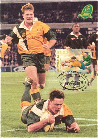
Welcome to professionalism, Rugby Union. Have a jersey that looks like an abortive SBS test pattern.
 This
was also the period of Wallaby history in which the technique was
developed of predicting whether Matt Burke would miss shots at goal by
determining whether his hair was in place or not, and furthermore which
side he'd miss on by the direction his product-laden hair was pointing
in. He's going to slice this one right. Burkey redefined the meaning of
'fringe player'.
This
was also the period of Wallaby history in which the technique was
developed of predicting whether Matt Burke would miss shots at goal by
determining whether his hair was in place or not, and furthermore which
side he'd miss on by the direction his product-laden hair was pointing
in. He's going to slice this one right. Burkey redefined the meaning of
'fringe player'.Actually come to think of it the current jersey's pretty fucking horrible as well.
13. The Dutch national team, any time, any sport

Oranje. Is goed, yessh?
This particular shitty stick also gets justly pointed at anyone else who turns up to work in high-visibility jackets who doesn't drive a truck or work on a council roadworks crew - Queensland Roar, I'm looking at you - and the entire complement of Nike-sponsored teams at the 2002 World Cup who all appeared to have been coloured in with a highlighter pen (see point five over here for further exposition.)
12. Mario Cipollini, Team Saeco, 2001 Giro d'Italia (competitive doping)

Vaguely reminiscent of a Robbie Williams music video of roughly the same era. That was shit and so is this.
11. Australian Socceroos, 1992, international football or the fringes thereof
 Designed
for long-term Socceroos fans sick to the back teeth of not qualifying
for the World Cup since 1974. Wear the '92 jersey and throw up on
yourself with pride AND practicality.
Designed
for long-term Socceroos fans sick to the back teeth of not qualifying
for the World Cup since 1974. Wear the '92 jersey and throw up on
yourself with pride AND practicality.10. US Ryder Cup team, 1999, golf
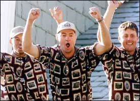
Golfers look stupid at the best of times. But an outfit stupid enough to even make the late Payne Stewart look merely normal... that's some sort of achievement, sick and wrong though it is.
9. Central Vikings, about 15 minutes during the mid-to-late '90s, NZ NPC rugby
 Seriously, what the fuck was wrong with people in the mid-to-late '90s?
The Central Vikings resulted from the short-term (1997-98) merger of two fairly shit lower North Island rugby provinces, Manawatu and Hawkes Bay. The merger lasted two years of the two provinces being collectively shit before they went back to being individually shit, as they remain to this day.
8. Australia, 2007-09, Twenty20 cricket


The unitard-with-vest, as pointless as it is vomitiferous. (The outfit, not Warner.) The individual responsible for this particular 'creative concept' is currently being beaten about the head with one of D.K. Lillee's old aluminium bats. Hopefully.
7. Australia, 2005-06, Twenty20 cricket

I guess we should be thankful for the march of progress.
6. Any Arsenal away shirt of the 90s (but particularly 1991/92), English football

Actually, pretty much any Premier League away shirt of the '90s would do.


Or the goalkeepers, for that matter.
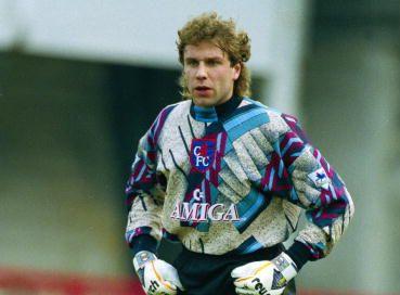

Technically the last one isn't Premier League but it's so astonishingly crap it has to go in.
5. New Zealand BLACKCAPSLOCK, 1977-86, World Series Cricket


The uniform so heroically awful it spawned its own supporters club.
 Special
commendation to the Green Horrors, the teal-and-black outfit in which
the now-BLACKCAPSLOCK embarrassed themselves in the late '90s (though
they did win the 2000 Champions Trophy, somehow)
Special
commendation to the Green Horrors, the teal-and-black outfit in which
the now-BLACKCAPSLOCK embarrassed themselves in the late '90s (though
they did win the 2000 Champions Trophy, somehow)4. Anyone from Super League, 1997 (again), rugby league (allegedly)

Cunts.
(Sorry, but they were, and are.)
If we have to pick one to highlight - the Broncos.
For being the biggest cunts of all.

3. Vancouver Canucks, living the '70s dream of brown and orange well into the '90s, NHL

Said it before, said it again. Flash Gordon at the Mardi Gras, on ice.
Cheers to Steve for bringing this to our attention.
2. Athletic Bilbao, 2004/05, UEFA Cup football

Fuck me, you might be thinking, that's actually really awful. But it's worse than that. Someone at the kit sponsor actually drew this up, and somebody at the club actually signed off on it. Which means there are at least two absolutely batshit insane individuals at large in Europe, and have been for at least four years. I advocate evacuation of the entire continent.
1. The South Sydney Rabbitohs, 1908-2009, NSWRL/ARL/NRL
First, an admission... a statement of the bleeding convulsing haemorraghing obvious, in fact. This page bleeds coachwood and myrtle (or even red and green) and has done since its existence. But, of course, backing the Rabbitohs doesn't mean we're blind to the many and varied flaws and foibles that our favourite club struggles under. To be brief, they are two: a Narcissistic twat of an owner with a Jesus complex whose band has been compared to used food, unfavourably but accurately; and the fact we turn up to play looking like a series of Christmas baubles.
 But
it's not the traditional Souths jersey that's the problem here. Fuck
no. When you look like thirteen of Santa's elves you need to play with
more front than a Mack truck and more grit than a frosty mountain road.
Google 'John Sattler broken jaw 1970 grand final' for a salutary tale of what happens when cheating silvertail mongrel scum (that'd be the Manly-Warringah Sea Eagles for those playing at home) are stupid enough to underestimate the bravery and tenacity of the mighty Bunnies. And we beat the Christ out of you twunts near the end of last year, which makes us 2008 premiers by logical induction, so get fucked.
But
it's not the traditional Souths jersey that's the problem here. Fuck
no. When you look like thirteen of Santa's elves you need to play with
more front than a Mack truck and more grit than a frosty mountain road.
Google 'John Sattler broken jaw 1970 grand final' for a salutary tale of what happens when cheating silvertail mongrel scum (that'd be the Manly-Warringah Sea Eagles for those playing at home) are stupid enough to underestimate the bravery and tenacity of the mighty Bunnies. And we beat the Christ out of you twunts near the end of last year, which makes us 2008 premiers by logical induction, so get fucked.No, the traditional Souths jersey is, officially, tha shizzle. My nizzle.
But, given that no other team plays in the festive combination of lateral red and green stripes, largely because no other team would ever want to... what the fuck is the point of THIS?

Its a Souths away jersey.
It's the 2009 one, apparently. And it's by no means the worst since the Bunnies were readmitted to the comp in '02.
 The
second worst, a piss-poor ripoff of the St George 'V' is one I admit to
owning, in theory because it was the first shirt in which they won a
game after readmission - round two, 2002, vs Canberra - but in reality
because it was on special at Rebel Sport for fifty bucks because it's
ugly as a hatful of arseholes. It has apparently been expurgated from
the internet and for that we should be thankful.
The
second worst, a piss-poor ripoff of the St George 'V' is one I admit to
owning, in theory because it was the first shirt in which they won a
game after readmission - round two, 2002, vs Canberra - but in reality
because it was on special at Rebel Sport for fifty bucks because it's
ugly as a hatful of arseholes. It has apparently been expurgated from
the internet and for that we should be thankful.The worst was the one at right, originally from a couple of years ago, then inflicted on the under 20s side in an act of bastardry bordering on child abuse.
So the new away jersey's not that bad. The fake Maori squigglings are a massive wank, but I guess there's a lot of Kiwi internationals plying their trade in the side and a lot of international Kiwis plying their trade in the local area (i.e. filling in dole forms), so it's a massive wank that has some vague justification.
But I return to the unanswered question: why the fuck does a team whose jersey can, by definition, clash with noone elses, need a fucking away jersey?
We managed to play Canberra at least twice a year for the best part of twenty years across the '80s and '90s without our boys and their boys getting confused as to who was who. And that included several seasons in which NRL Footy Show 'personality' and noted idiot, 'Test Match' Mario Fenech, was our captain. Who else are we going to play across the course of a year who there could possibly be a colour conflict with? Seriously, who the fuck are we going to clash with? Freddie Krueger?
 |
| Freddie had a reputation as a brutal front-row enforcer, but his ball handling skills were absolute crap |
The Doctor is OUT.
*We did manage to touch up the Panthers in Coffs though by fuckin' shitloads to not much. Yay us.


20 comments:
That has got to be the biggest non-political rant post by anyone ever!
I am red/green colour blind to I always assumed South Sydney wore that jersey just to piss me off.
Yeah Serena might want to get something that, erm, flatters her figure a little more. 'Flatter' would be a good start, there's quite a bit of her to wrap up. As for Cipo, he was a bloody good sprint cyclist but a wet sack of shit when it came to the Tour de France. Still holds the record for the most stage wins but he always chucked it in as soon as the first of the big hills came, so he was only in each year's race for the first week.
Always wondered what Souths' jersey looked like to someone with R-G colourblindness. Alternating shades of grey I guess? Probably marginally less shit than non-colourblind people have to put up with, so maybe a minor tick in the plus column on that one Naut.
A great post - some awesome uniforms there - A real toss up between the beige brigade & the Vancouver Canucks.
Is it possible that the pink West Indian uniform from World Series cricket has slipped through unnoticed?
Great post
How the hell did I manage to forget the Windies in their 'nupple pink' (thanks v. much Tony Greig) uniforms!
If I'm not a complete internoob this different coloured text here should link to a stellar Cricinfo photo of Clive Lloyd looking in no way self-conscious about the ironic sense of fashion Kerry Packer had foisted upon him.
The French Rugby kits, the third one, my daughter has a bathing suit almost that exact same style/color/pattern. I guess they look like 10 year old girls when playing.
Vancouver only wore that heinous uniform back in the 70's and early 80's, by the 90's they had something more along the lines of the blue/white they have today.
And I remember the Astros. Whenever they played my team, the NY Mets, we didn't boo them, we booed their uniforms.
And seriously, did Sevilla hope to maintain some dignity by keeping the black socks? They already went that far, they should've done the whole God-forsaken kit pink. Including the boots. Nike would've made something special for them surely, and if not, Diadora would've stepped up. Adidas and Puma, however, would've simply shaken their heads and said, "Nein."
Question...the 20/20 cricket team, the guy second from left on the bottom....is there something wrong with his mouth?
Not sure how much Mexican football you get (I can see it all the time, we have 3 Spanish stations here), but if you have, you would know this fact: Mexican footballers will wear anything. ANYTHING. And they will then cover it with advertisements. Here's one of my favorites:
http://www.premiershirts.net/wearthat/wearthatshirts/UG.jpg
The Astros shirt always reminded me of that Tide-sponsored NASCAR that was around for a bunch of years. Looked like a virulent infection on wheels.
I thought I saw a photo of a Canuck in a non-V'd version of the brown and gold dated from the mid '90s but it could have been a one-off throwback jersey - will bow to your greater judgement on this.
Juventus had a pretty foul pink away jersey a few years back as well (Nike supplied) but being Italian they carried it off a bit better - and more importantly, they won wearing theirs. Doesn't matter how butt-ugly your shirt is if it's hanging in the shops at the end of the season with a 'Champions' logo embroidered on it. We don't get much Mexican football - when we do, every second team seems to have 'Bimbo' written across its chest, which I always find amusing - but they always seem to find something spectacularly awful to wear for international tournaments. The watermarked Aztec coin seems to be a recurring theme. The worst international uni ever might have been that US '94 away shirt with the acid-washed stars and stripes, but I left that out on account of not wanting to start an international incident. Well, not another one.
SF have been playing like 10 year old girls for much of the season apparently. There's Australian interest because the former coach of the NSW rugby team and the former star centre for the St George rugby league team both defected to them. Which is apt as their jerseys are about as defective as you can get. As I mentioned they lose a lot of points because they're designing and wearing fucking awful outfits on purpose in order to appear interesting, like a fat man in a Hawaiian shirt.
Ah yeah, second from bottom in the '07 T20 World Cup team photo - that's our man Andrew 'Roy' Symonds, the drunkest man ever to play for Australia. Since the '80s at least. He's a West Indian born to adoptive English parents in Birmingham (not Alabama), which apparently makes him a Queenslander (just ask him, though he'll probably snot you one for even asking). Does his hair like the Predator. The mouth thing is zinc cream for sun protection. Actually he's had a bit of a poor run recently. Keeps having 'incidents' at Brisbane pubs, recently he was also interviewed half-cut on national radio and said a bunch of very ill advised stuff that even Sean Avery would have steered clear of. He's the loosest of loose cannons but his absence (injury rather than detox enforced) is probably why we suck a suckload of suck at the moment.
The french uniforms made my flesh crawl and as for the Williams not women... shudder
Interesting you didn't bring up the 'Hi tech' grey england soccer strip, that was soooo advanced but still didn't allow them to win any trophies!!!
Athletico Bilbao and the Canucks get my vote.
Chaz, had forgotten about the grey England strip - was that Euro 96? - but that grey knitted jumper look Man U away strip has its own stories to tell of course. For those who don't know it was the only playing strip ever blamed for its wearers being 3-0 down at halftime (against Southampton I think, le Tissier ripping them several new arseholes in the process) - Ferguson ordered his players to change at half time because supposedly they couldn't see each other out on the pitch for the lack of contrast between the shirts and the crowd in the background. Still lost, to much amusement from the rest of the Prem.
Vancouver might've gone for the "throwback" if they wore it in the 90's, quite a few teams have done it. But normally, it's done when the old uniform is cool. I would like to see my Devils go back to the old Red and Green (fortunately, not a Christmasy red/green....they used green because New Jersey is "The Garden State").
And no offense taken, that US flag jersey was pretty bad. The US has gotten much better, going instead with very simple kits for both women and men. I've never been a big fan of turning a kit into a national flag. It always looks cheesy.
And the person wearing the Socceroos kit above looks like Linda Hamilton. Is he being chased by a terminator?
That's true, Nike did pretty well with the US kit for Germany 2006. Actually they reigned themselves in a lot, let everyone have unis they weren't actually embarrassed to turn up in - hell they even let us show up in plain gold shirts which was a novel change of philosophy. And as a direct result we became Champions of the World (by logical induction, by similar means to why South Sydney are legitimate 2008 NRL premiers.) We got hoaxed by Italy (penalty my arse), they won the big cheese, hence we're world champs. Easy.
I don't know quite what's up Milan Blagocevic's arse (the dude with the quite stellar mullet in the Socceroos jersey) but it seems quite pointed. He may be some relation to the dodgy Illinois deputy gov, not sure.
I'm with you on most of these Doc. I even have a Panthers jersey lol. Good to see 90's English football jerseys finishing strongly. They really had some horrible ones in that era.
Not much to add really except maybe the King of the Mountain Jersey on the Tour d France. Also the early Brisbane Bears AFL top with the stylized Koala. And maybe the NQ crushers jersey that had the color scheme of home brand beer.
HOW THE HELL DID WE FORGET PALERMO???!!!!!1111ELEVEN1111!!!!
http://store.ilpalermocalcio.it/Default.asp?lingua=ENG&
Jesus Christ, what the hell is wrong with those Dagos?
Have to give Palermo a pass mark on their shirts - partly because our man Marco Bresciano plays for them - but largely because of the fact Palermo is the capital of Sicily and I've got no particular interest in slagging off their faaahhhshun sense only to discover my feet have been placed in bricks of quickset concrete en route to a date with an ocean pier. Capiche?
Oh Christ, the Bears. They had some complete shite going on in the '80s. I think they even did a pink and gold one (probably when Warwick Capper ponced up the coast to play for them) Have a look and judge for yourselves.
KOM jersey is distinctive, at least. In the same way getting small pox is. Fairly similar clinical presentation too, I'd guess - breaking out in large red circular blotches.
Having grown up in New Jersey, Sicilians don't frighten me. Once they cross the Delaware River, they get scared and confused. That's why they bury their victims in landfills in New Jersey, and why the bodies are then found and the killers subsequently caught.
Question...why does the AFL wear the tank tops? They're close enough to basketball jerseys, which is a shit sport in my opinion, that I'm kind of thrown off by them. I expect something closer to football (FIFA football, that is) or rugby jerseys.
The Victorians probably could tell you better than I could (Havock and Nautilus) but my guess would be for upper body mobility. Historically I think they started out in the same sorts of heavy cotton jerseys that rugby and football players began in, but I'm guessing they found they needed something less restrictive across the upper arms and shoulders - AFL footy is a game played largely in the air, lots of catching the ball above the head. They're also infamous for wearing ridiculously small shorts, which supposedly is also to aid kicking and running, but we in the northern (rugby league playing) states always reasoned that was more due to widespread latent homosexuality among all the AFL states.
Post a Comment